Need some nursery inspiration, or just feeling broody and want to window shop? Here I’ve selected 16 awesome nursery makeovers to delight and amaze, full of cute finds and awesome decorating ideas that might just help you figure out how to make your nursery special.
1. Decor8Blog
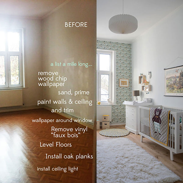
This was a room with plenty of space, but it looked pretty dingy and the floor was a tacky vinyl “faux bois” (fake wood), which didn’t look at all good in the light. The final product looks deceptively simple, but Holly put a lot of work into this nursery, replacing the floors with oak planks, repainting and sprucing everything up. She went with a simple theme for most of the room, with a patterned accent wall to keep the room from being washed out (especially with those nice big windows!). The rugs soften the room and add a luxurious sense of comfort, while the layout stays mostly open and easy to keep tidy. I only worry about that white rug – colours might have spoilt the theme a little, but white stains so easily! You will find step by step guide on this makeover on her website.
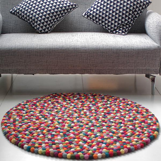
Design your own custom coloured rug and see how it looks in your nursery before investing on them.
2. Martha Stewart
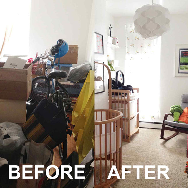
Got a chaotic storeroom, despairing of how you can ever tidy it? This post on Martha Stewart Living is an inspiration to us all – from cluttered closet to a small and cosy nursery using the right curtains and some simple furniture. The cute broccoli and carrot pillows give it a whimsical air, and the prints on the wall break up the whiteness. It’s a room that can easily be adapted as the baby grows up and forms their own tastes, and aside from moving the clutter, it doesn’t look like they had to do too much! For detailed info, go to her website. Just stay away from all the ads and pop ups.
3. Apartment Therapy
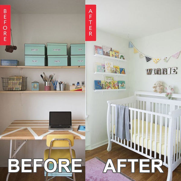
From a functional studio space to a baby’s room! I really love the idea of decorating the room with the books, rather than having them lined up on a shelf with their spines out. Books always give a room a comfortable feel, and children’s books are so bright and cheerful that they’re the perfect splash of colour in a practical, white-painted room. And keeping the space white means that even though it looks relatively small, it doesn’t feel claustrophobic. Click here for more info.
4. Design Sponge
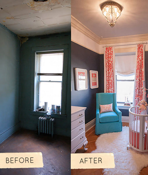
This nursery makeover has a bit of a vintage feel somehow, with that ceiling light and the patterned curtains. Even though it’s a small space, the dark walls work well with the pale furniture, and the colour scheme works well. Remind me to try blue and orange together more often! This nursery also feels pretty gender neutral, and like it should be a cosy place for the mom-to-be to sit as well; imagine digging bare toes into that carpet and reading on that chair while baby sleeps! Click here for more details.
5. A Beautiful Mess
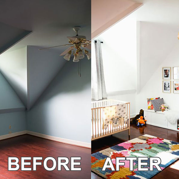
The first photograph makes this room look so full of awkward angles and shadows, but Sarah’s colour choices brighten it up perfectly, reducing the appearance of that awkward corner and giving a feeling of a much more spacious and comfortable room. The splash of colour from the rug is just perfect too, and you don’t need to worry about slips and spills on that kind of rug – it’ll just blend into the pattern. Having photos of the baby (or a sibling) on the wall is a sweet idea, making the space all about the little one. Click here for more details.
6. Elle Decor
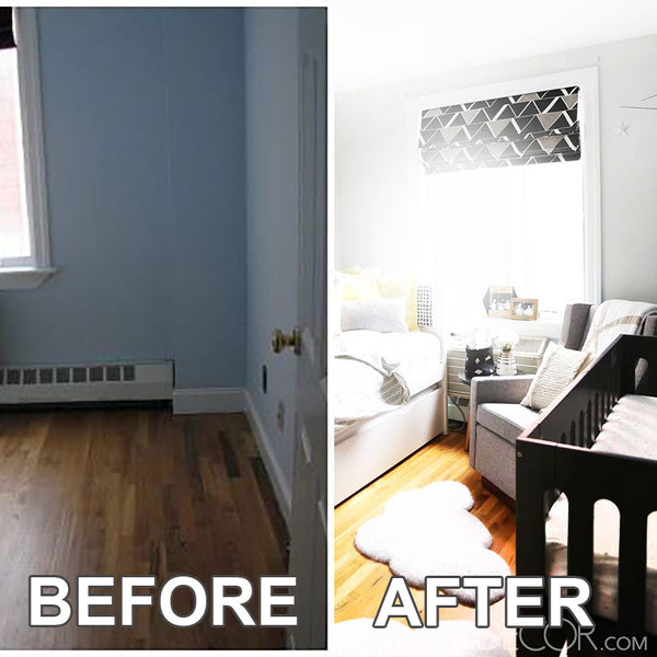
This white room with black crib looks just perfect: striking, but simple. The dad-to-be added fun little accents – those are plates on the wall! – that match the colour scheme and bring a bit of individuality and quirkiness into a fairly functional space. Keeping the colours light helps avoid a cramped feeling, despite the relatively small space available. For more details, go to the website.
7. The Jungalow
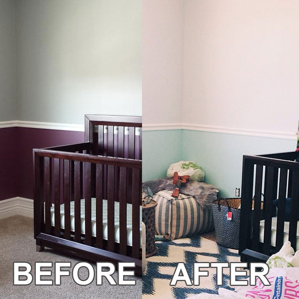
From a plain and functional room to something bright and colourful, this makeover really makes the space pop. It’s full of colour and texture, making the most of the space and totally transforming the rather dingy space. The patterns on the rug, cushions and furniture really help bring the room to life. Click here for more info.
8. Perfectly Imperfect
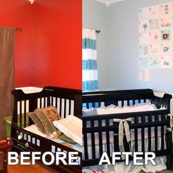
The room looked like a guest room to begin with – not the sort of space you’d want to live in. The change to the colour scheme is nice and neutral, perfect for any child, and the colours are restful too. You’re going to need that if you’re having a baby. Click here for more info.
9. Sadie Road
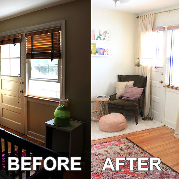
The before picture is a bit too dark to get a good look, but the rearrangement of the furniture definitely helps create more of a sense of space. Despite the fact that the colour palette is, if anything, reduced, the room looks more colourful because of that carpet – a colourful carpet is always going to be a good choice to bring a room together. More details here.
10. My Domaine
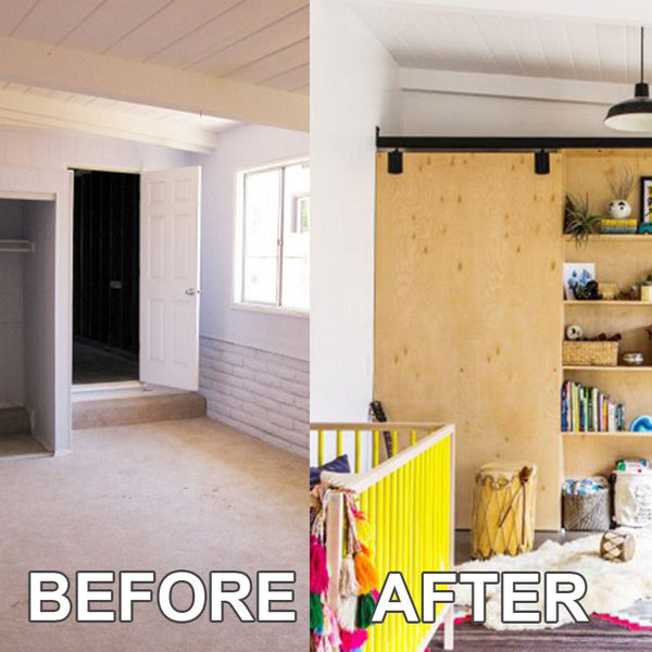
From a plain space to something bright and cheerful! The plant in the corner adds a nice touch, and will tend to freshen the air in the bedroom too. Just don’t forget to water it while you’re running around after the baby. Click here for more info.
11. Apartment Therapy

If you read the source article, turns out that this makeover was done in just 24 hours. Whoa. It’s uncluttered, practical, with plenty of room to go. And I don’t much like taxidermy, but that plaid deer head is actually kind of appealing… This nursery design takes advantage of the clean brightness of the room and doesn’t make any change to that gorgeous wooden floor – so easy to clean and low maintenance, and it still looks good. Click here for more details.
12. Curbly
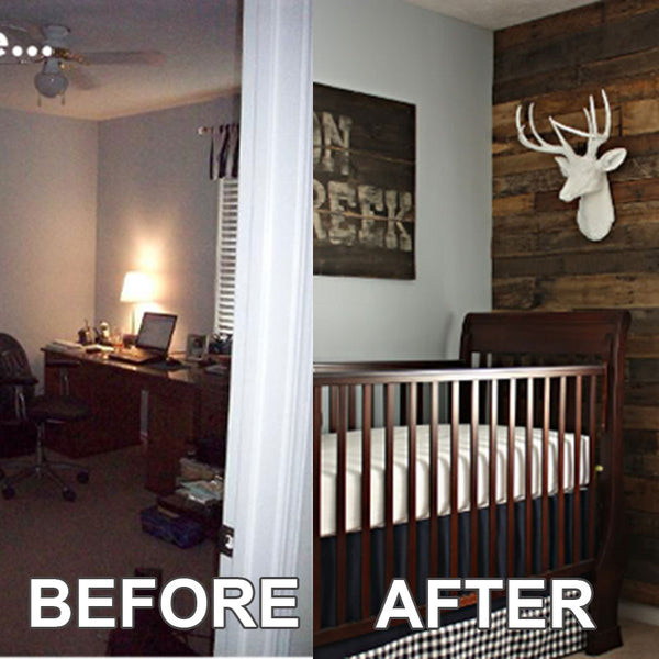
I’m not 100% sure of the need for a super masculine nursery, but this project certainly transformed the room into something much more striking. I love the wooden planking on the wall – though what’s with this trend for deer heads? That’s the fourth one I’ve seen while putting the article together! More info here.
13. Boots And Totty
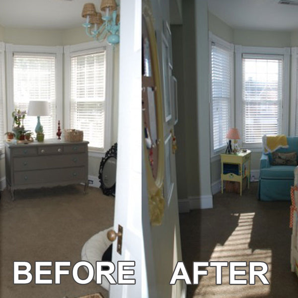
Will zebra heads prove to be the next hot trend? I don’t know, but I love the pastel colours here and the stripes on the walls. It keeps things muted and calm – and trust me, you’re going to need to hold onto all the calm you can find. Click here for more information.
14. Our Celebrated Life - For TWINS
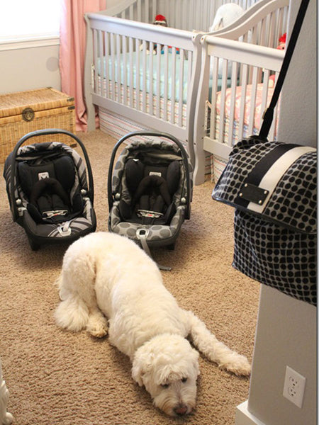
This might not be a before-and-after makeover, but I just had to share this adorable room for twins anyway. It features both pink and blue, and those polka dots on the wall are amazing. The author also has some cute ideas on keeping an eye on your babies’ milestones! For details, go to Ashley's website.
15. Winter Daisy
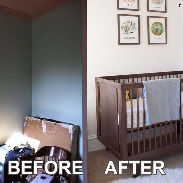
It’s amazing how much space repainting seemed to create! If you have a small space to transform, definitely take a lesson from this makeover: keep things simple! And make sure that chair is comfy: it’s a fair bet you’ll be spending a lot of time in there, and you’re the one who has to sit in it, not the baby! Click here for details.
15. Foofool Mom
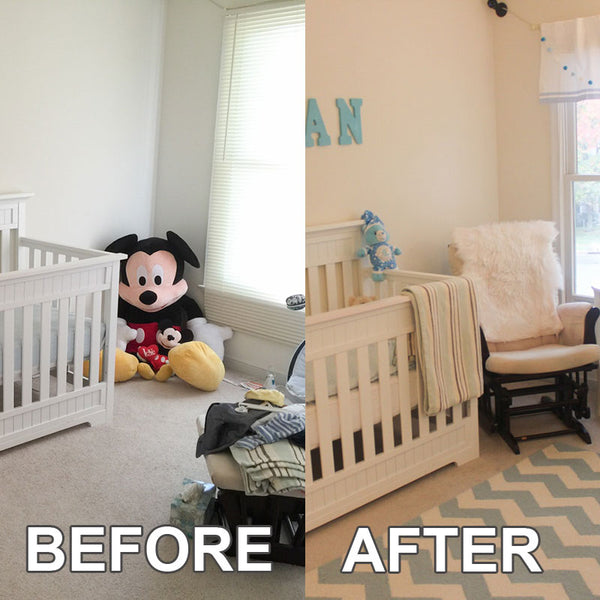
This one just goes to show that moving things around, providing storage space, and adding a rug can really change a room! You don’t have to get really fancy – after all, the baby isn’t going to notice or remember. A functional room which is comfortable for you and easy to keep clean and tidy will make everyone happier in the long run. Click here for more info.
16. Laurel And Wolf
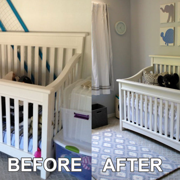
Sometimes, just decluttering can be the name of the game! This nursery makeover has mostly just tidied up what was already there and added some decorative touches. The set of shelves provides storage space, and that silvery theme is just gorgeous. Click here for details.
If you’re not feeling inspired yet, just click through the links! A lot of the posts include other pictures and even lists of sources for the items featured. Some of the blogs and sites even feature multiple different makeovers.
Here’s the key things I learned from going through these pics:
- Plan ahead. You’re going to need storage space.
- Light colours make a room look so much more spacious and bright. You don’t want a gloomy nursery, so soft whites and creams or pale blues might just be the perfect choice for a small room. Larger rooms can handle darker colours a lot better.
- Not everything has to match. If you think it’s cute, why not?
- A nice rug or a change of curtains can transform a room, and warm it up as well. If your nursery is feeling cold and impersonal, something like that might just work wonders. Maybe a patchwork quilt, for a traditional look…?
But maybe the most important thing to remember is that you’re not really making a room for your baby. You’re making a room in which you need to spend a lot of time! Make it comfortable for you and the baby will be happier for it.
(You should also consider looking up how to keep your nurseries toxin-free. Knowing the issues before you go shopping could save you time – and health trouble! – in the future.)
Please share this article so your friends and families will benefit from it.

